
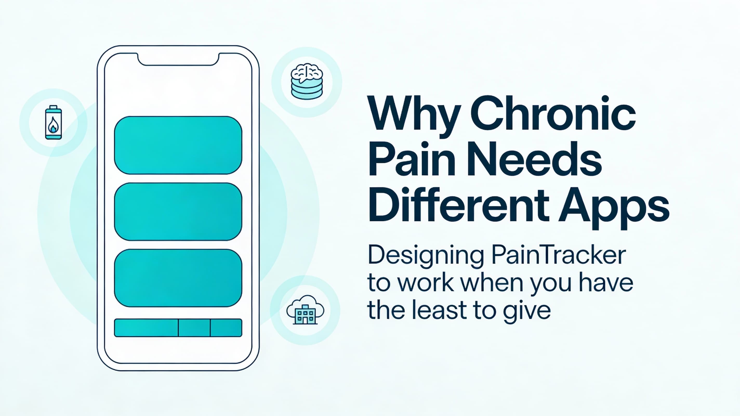
Why Chronic Pain Needs Different Apps

Imagine trying to log a symptom in the two quiet minutes between obligations—while you’re tired, hurting, and hoping the app won’t ask you to think too hard.
Most symptom trackers are built around a quiet assumption: the user will reliably log data every day, interpret charts, and steadily “optimize” themselves.
Chronic pain doesn’t work like that.
Pain is not a neat, single-variable metric. It changes with context (sleep, stress, weather, workload, medication timing, mobility limits, sensory overload) and is constrained by energy, attention, and safety. If your app demands too much—too many taps, too much typing, too much remembering—it becomes one more thing the user has to endure.
This is the core premise of PainTracker’s approach: if logging feels like a small tax on a good day, it can feel impossible on a bad day. So the product should work best when the user has the least to give.
The three constraints most apps ignore
1) Energy is variable (and precious)
“Just log daily” is not a neutral instruction. It’s a design commitment.
For chronic pain users, energy can swing dramatically between morning and evening, between weekdays and weekends, and between flare and non-flare periods. A health app that requires a full “session” to log anything will cause drop-off precisely when the data would be most valuable.
Design implication: the app must support meaningful partial entries. A quick capture that can be enriched later is better than perfect data that never gets recorded.
2) Cognition is a first-class dependency
Brain fog, medication effects, sleep debt, and stress all reduce working memory and executive function. That can look like:
- difficulty comparing “today vs last week”
- difficulty remembering what happened earlier in the day
- difficulty translating experience into numbers under time pressure
Design implication: reduce recall. Prefer “recognition” UI (pickers, presets, recent selections, gentle prompts) over blank text fields. Keep the next action obvious and keep state visible.
3) Environment is messy
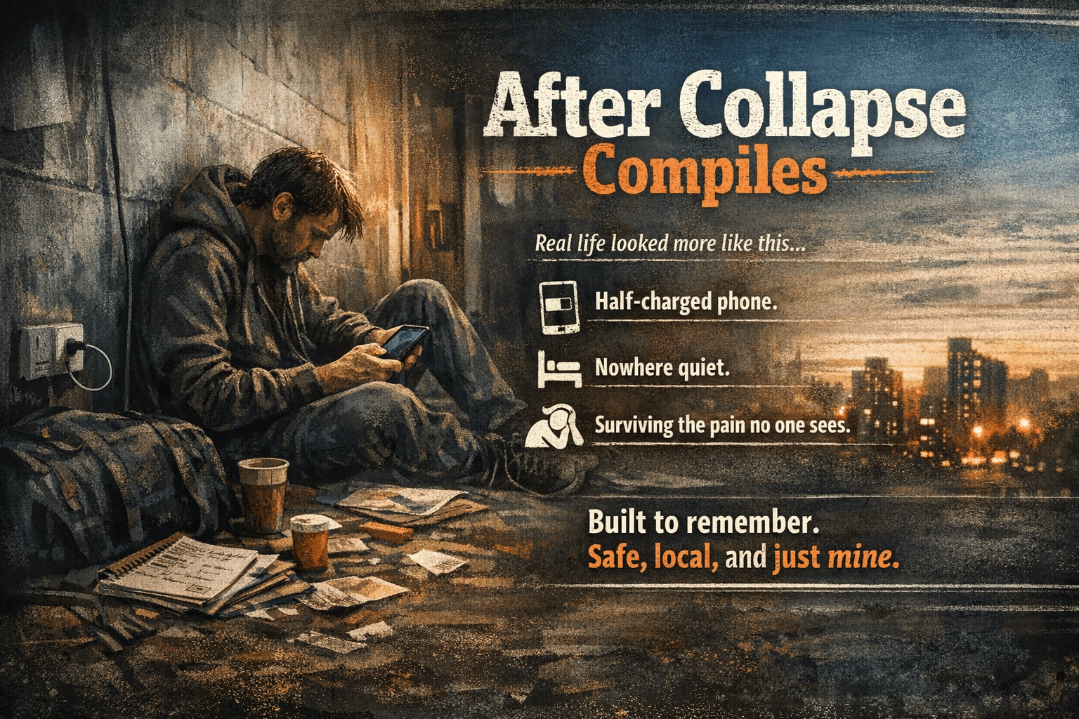
People log health data on the couch, in a car, in a clinic waiting room, or during a break at work. They may have intermittent connectivity, one hand free, glare on the screen, or a strong need for privacy.
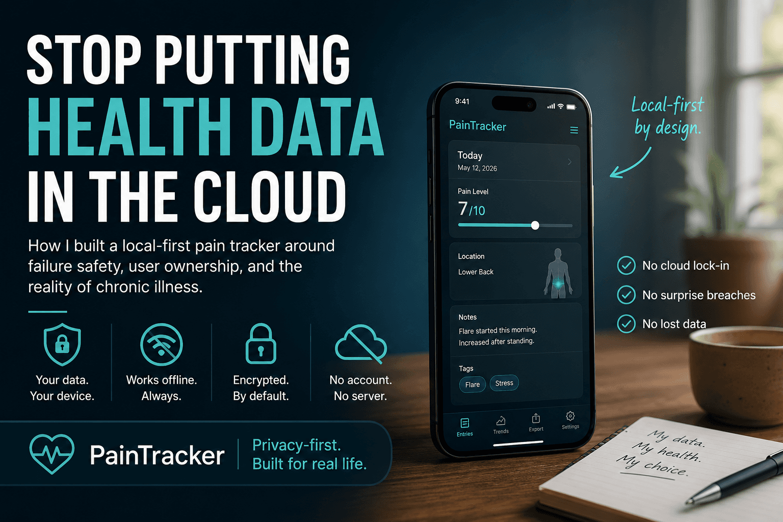
Design implication: offline-first isn’t a nice-to-have. It’s reliability. The app must behave like a local utility, not a web page that sometimes works.
What “success” looks like for a chronic pain tracker
Success is not maximum engagement. Success is:
- the user can capture what matters in under 30 seconds
- the history view helps them notice patterns without demanding interpretation
- exports are clean enough to reduce appointment friction
- the app never surprises them with data leaving the device
A simple checklist to keep you honest
If you’re building a health PWA, run your design through these questions:
- Can I log something meaningful with one thumb?
- Can I log when I’m offline and trust it won’t vanish?
- Can I use the app with keyboard-only and a screen reader?
- Does the UI still work when I’m tired, medicated, or overwhelmed?
- Do I understand exactly where my data lives and when it moves?
If any answer is “no,” that’s not a future enhancement. It’s part of the product’s definition.
Next: Part 2 — Architecture of a Privacy-First Health PWA
Next, Part 2 maps an offline-first, privacy-first architecture: data flow, local storage boundaries, failure modes, and the threat surfaces you inherit the moment you store health data.