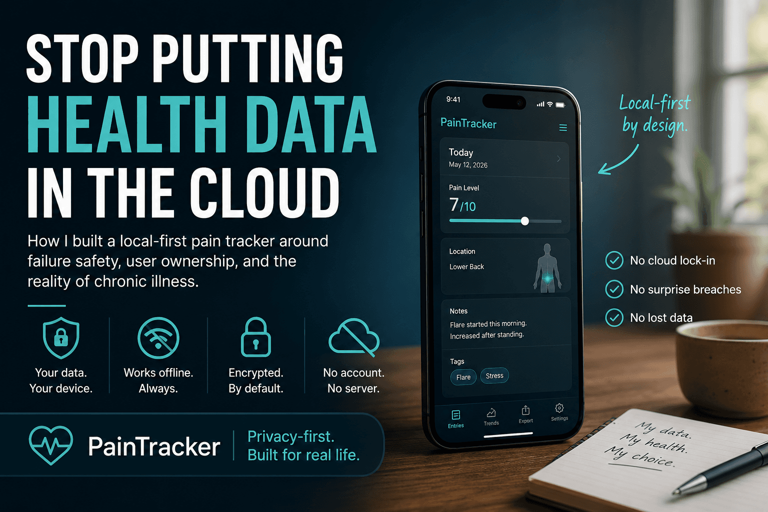

Interaction patterns That Don’t Hurt
Most people don’t quit because an app is missing a feature. They quit because the tiny moments of friction add up—especially when they’re already in pain.
The best features in a chronic pain app are often not “new screens.” They’re the small interaction decisions that reduce effort, prevent mistakes, and preserve dignity.
These details matter because they show up in the moments when the user is already overloaded.
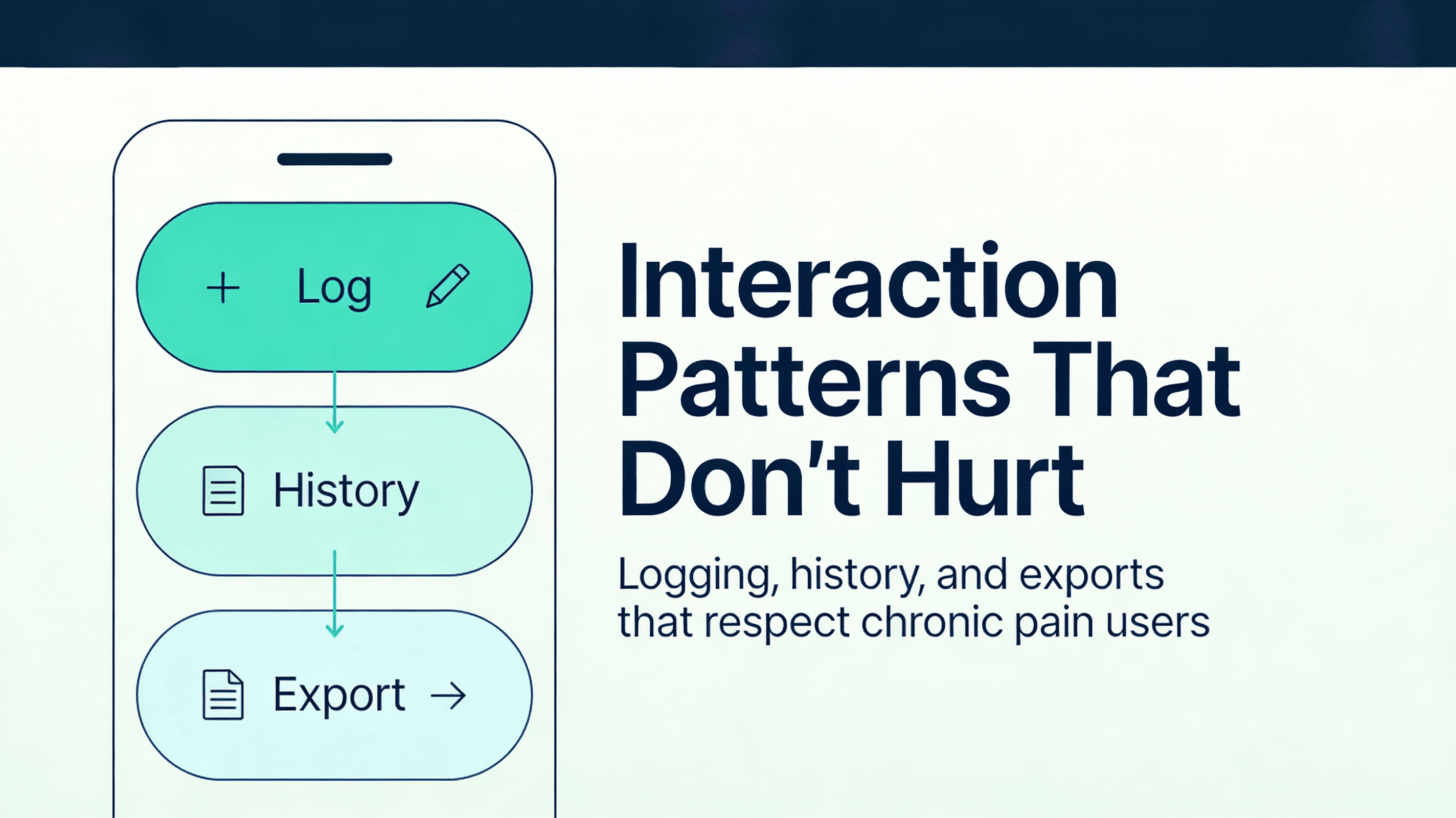
We’ll focus on three flows that define whether a pain tracker is usable in real life:
1) logging (capture) 2) reviewing history (sensemaking) 3) exporting (advocacy and clinical/workflow utility)
Principle 1: design for the worst day, not the best day
On a good day, almost any UI works.
On a bad day, the user has less energy, less tolerance for ambiguity, and less ability to recover from errors. So your UI should be optimized for:
- partial completion
- fast success
- safe failure
Flow A: logging (capture) without friction
Pattern A1: “minimum viable entry” as the default path
The fastest path should always be available and always be meaningful.
Example minimum:
- one field that reflects function impact (interference)
- optional location
- optional “what happened?” preset (work, travel, sleep, stress)
Everything else is additive.
This is how you respect variable energy: the app accepts the user’s best effort today.
Pattern A2: recognition UI (presets, recent choices, quick picks)
Typing is expensive.
Use:
- recent selections (“last used locations”)
- common presets (“heat helped,” “work shift,” “poor sleep”)
- small controlled vocabularies (quality: aching/burning/stabbing)
The goal isn’t to constrain the user. It’s to reduce cognitive load.
Pattern A3: safe defaults and reversible actions
If you guess, make the guess safe.
- default timestamps to “now,” but allow correction
- default fields to empty/unknown rather than fabricated values
- allow undo when feasible (especially for deletions)
Reversibility is accessibility.
Pattern A4: progressive disclosure for advanced fields
Advanced fields should exist, but they shouldn’t block the primary task.
Keep them behind an explicit “Add details” step that never feels mandatory.
Flow B: history review without demanding interpretation
History views often fail because they ask users to do math with their pain.
Your goal is not to “prove” anything. Your goal is to help the user notice patterns and prepare for a conversation with a clinician, employer, or support person.
Pattern B1: show summaries first, details on demand
Start with:
- simple timelines (days/weeks)
- counts and durations (episodes per day, flare duration)
- functional impact highlights
Then allow drill-down to the full entry.
This supports brain fog: users can orient first, then explore.
Pattern B2: avoid false precision and causal language
If your UI implies causality (“weather caused flare”), you will harm trust.
Prefer language like:
- “Often occurs after…”
- “Seems to co-occur with…”
- “Noticed around the same time as…”
This is more clinically honest and less emotionally loaded.
Pattern B3: allow “today vs typical” without complex charts
Charts are optional. Comparisons are useful.
Provide:
- “Today compared to your last 14 days” in plain language
- “Most common locations this week” as a short list
- “Most helpful interventions” as a ranked summary
If you do show charts later, make them readable, labeled, and keyboard/screen-reader compatible.
Flow C: exports that help, not harm
Exports are where a pain tracker becomes an advocacy tool.
They’re also a major privacy risk because exports are designed to leave the device.
Pattern C1: explicit intent and clear boundary messaging
Treat export as a boundary crossing.
- the user initiates export
- the UI clearly states what will be included
- the UI previews the result (or a representative sample)
Avoid hidden background exports, autosync, or “share to cloud” defaults.
Pattern C2: minimal by default, detailed by choice
Start with:
- date range
- high-level summaries
- functional impact
Then allow opt-in detail:
- notes
- intervention details
- episode-by-episode timeline
This reduces accidental oversharing while still supporting clinical needs.
Pattern C3: clinician/workflow readability over aesthetic design
Exports should be:
- consistent
- plain-language
- defensible (“this is what was reported,” not a diagnosis)
If a report reads like a marketing brochure, it won’t be trusted.
Pattern C4: accessibility in export generation UX
Export UI must be accessible too:
- keyboard reachable
- clear focus management
- progress states that are announced
- a failure path that preserves user choices (don’t make them reconfigure the export)
Putting it together: a quick interaction check
For each primary flow (log, review, export), verify:
1) Fast path exists (under 30 seconds) 2) Partial completion is supported 3) Keyboard + screen reader works end-to-end 4) Errors are recoverable and non-shaming 5) No surprises at the export boundary
Next: Part 6 — Offline, Sync, and Failure Modes
Next, Part 6 turns the offline-first promise into a practical checklist: what to cache, how to think about background sync (if any), and how to fail safely when storage, network, or updates go sideways.