
Accessibility in Pain Tracking: Inclusive Design for Chronic Pain
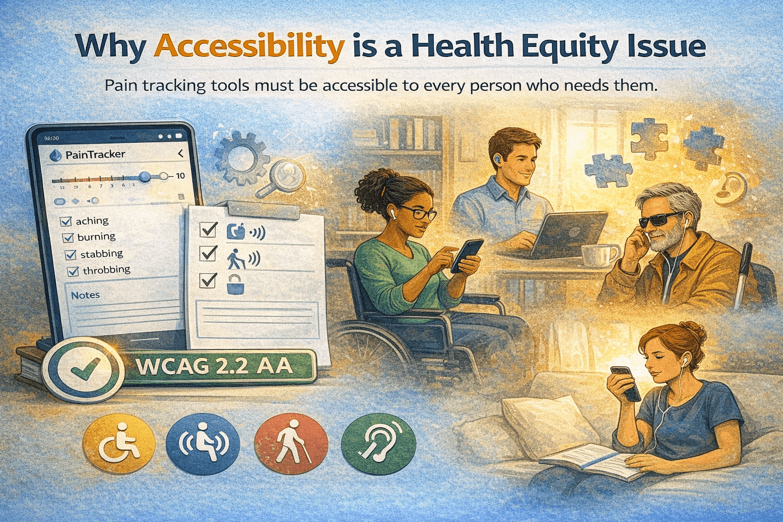
Why accessibility is a health equity issue
People who most need pain tracking tools are disproportionately likely to have accessibility needs. Chronic pain conditions frequently co-occur with mobility impairments, visual difficulties, cognitive fog, and fatigue—all of which affect how someone interacts with digital tools. An inaccessible pain tracker excludes exactly the people it is designed to serve.
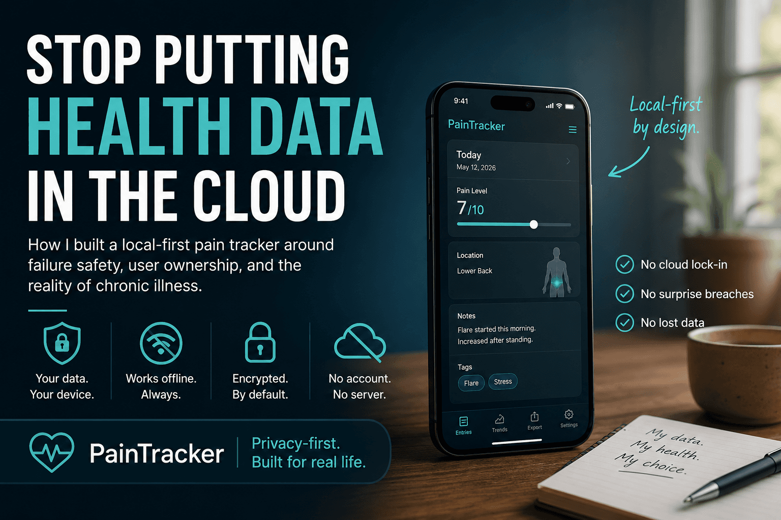
Accessibility is not an add-on feature or a compliance checkbox. It is a design commitment that shapes every interaction, from the size of touch targets to the language used in error messages. PainTracker treats accessibility as a first-class constraint: features are not shipped until they meet accessibility standards.
WCAG 2.2 AA: what it means in practice
PainTracker targets Web Content Accessibility Guidelines (WCAG) 2.2 at the AA conformance level. In practical terms, this means: all interactive elements are keyboard accessible, visual content meets minimum contrast ratios, touch targets are large enough for users with motor impairments, screen readers can navigate and interpret all content, and time-sensitive interactions provide sufficient time for all users.
Beyond technical compliance, WCAG 2.2 introduced criteria particularly relevant to pain tracking: minimum target sizes for touch inputs, focus appearance requirements for keyboard navigation, and accessible authentication flows. PainTracker's passphrase entry and daily tracking interface are designed to meet these updated standards.
Trauma-informed design principles
Chronic pain is frequently associated with trauma, and pain tracking can itself be emotionally challenging—requiring daily engagement with one's own suffering. PainTracker's trauma-informed design philosophy addresses this through several concrete practices: using gentle, non-judgmental language throughout the interface; providing user control over the tracking experience; reducing cognitive load through structured inputs; and offering quick exit mechanisms.
Error messages never blame the user. The interface does not pressure completion. Every interaction is designed with the understanding that the person using the app may be experiencing significant pain, distress, or fatigue at that moment. This is not just good UX—it is ethical design for a health tool.
Designing for reduced capacity
Pain flares reduce cognitive capacity, motor control, and tolerance for complexity. A pain tracker that is only usable on good days fails at its core purpose. PainTracker's interface is designed for worst-case capacity: large touch targets, minimal required interactions, clear visual hierarchy, and a one-swipe minimal entry path that captures essential data when you cannot manage more.
The application adapts to user preferences for text size, colour contrast, and motion sensitivity. These are not cosmetic settings—they are functional accommodations that determine whether the app is usable during a severe flare. Respecting the user's system-level accessibility preferences (reduced motion, high contrast, large text) is a baseline requirement.
Inclusive design as a competitive advantage
Accessible design benefits all users, not just those with identified disabilities. Larger touch targets are easier for everyone to use on a bumpy bus. Clear language helps everyone understand the interface faster. Keyboard navigation supports power users and users with temporary injuries alike.
For PainTracker, accessibility and privacy are both expressions of the same core value: respect for the user. Respecting someone's privacy means not taking their data without consent. Respecting someone's accessibility needs means not building tools they cannot use. Both are non-negotiable commitments, not feature requests.
Try PainTracker free — offline, encrypted, clinician-ready pain tracking.