
Accessibility-First UI Under Real Constraints
On a bad day, accessibility can be the difference between “I can log this” and “I’ll deal with it later” (and later never comes).
Accessibility isn’t a layer you add at the end. In chronic pain contexts, accessibility is the product.
People use pain tools when they’re tired, medicated, stressed, and often on a small screen. The “edge cases” (glare, tremor, one-handed use, brain fog, low patience for complexity) are not rare. They’re normal.
This is intentionally practical. It’s not a tour of guidelines. It’s a set of UI rules you can apply while you build—so the UI still works when someone is doing their best just to get through the day.
The accessibility bar: keyboard, screen reader, and low-friction
If the user can’t:
- navigate by keyboard
- understand the UI via a screen reader
- complete the primary flow quickly with minimal typing
…then the app will fail for many chronic pain users even if it “looks fine.”
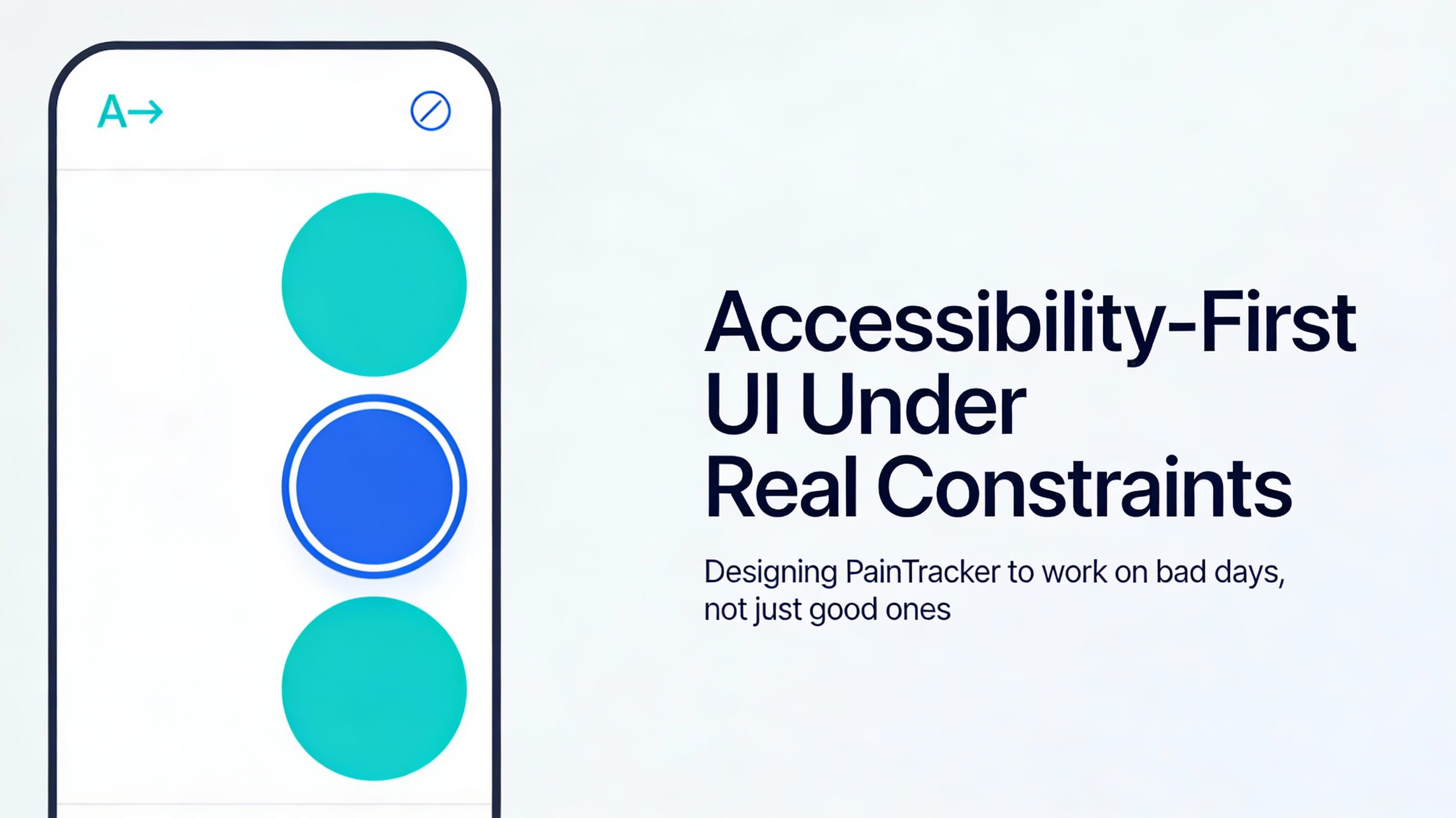
1) Contrast and color: don’t make the user decode your UI
Color is a fragile channel. People use devices in dim rooms, bright sun, and with visual fatigue.
Rules that hold up:
- Never rely on color alone to communicate state (error/success/selected)
- Provide clear text labels for status and actions
- Use large hit targets and strong focus states so the user can re-locate themselves
Practical test: convert your UI to grayscale. If meaning disappears, you’re using color as a crutch.
2) Typography: readability over aesthetics
In pain contexts, readability is a form of respect.
- Prefer shorter line lengths in dense views
- Use consistent heading hierarchy so users can scan
- Avoid tiny helper text for critical instructions
Practical test: zoom to 200%. Nothing should overlap or become unusable.
3) Spacing and layout: build for tremor and one-handed use
Small tap targets and tight layouts are hostile when hands shake, joints hurt, or only one hand is available.
- Make primary actions easy to hit with a thumb
- Keep destructive actions separated and clearly labeled
- Avoid placing important controls at the extreme screen edges where accidental taps happen
Practical test: use the app with one thumb for 60 seconds. If it feels fiddly, it’s too tight.
4) Focus, navigation, and “where am I?”
Keyboard access is not just for desktop users. Many mobile assistive technologies and switch inputs depend on predictable focus behavior.
Rules:
- Every interactive element must be reachable and show a visible focus state
- Tab order must match visual order
- Focus should land somewhere sensible after an action (save, cancel, close)
- Avoid focus traps (modals must be escapable; drawers must restore focus)
Practical test:
1) Start at the top of your main page 2) Press Tab until you can complete the primary logging flow 3) If you get lost, your users will get lost
5) Motion and feedback: never punish the user’s nervous system
Animation can be delightful, but it can also be nauseating, distracting, or cognitively expensive.
- Respect reduced-motion preferences
- Prefer subtle transitions over attention-grabbing motion
- Keep spinners minimal and always pair them with text (“Saving…”) so screen readers aren’t guessing
Practical test: enable “Reduce motion” at OS level and verify your UI still communicates state.
6) Forms: design for brain fog
Forms are where most health apps accidentally shame users.
Pain users often can’t remember details on demand. They often can’t tolerate long typing sessions. They may also be worried about privacy (who might see the screen).
Rules:
- Default to recognition over recall (pickers, presets, recent selections)
- Support partial entries (save with one or two fields)
- Clearly mark optional vs required
- Avoid multi-step flows unless each step saves progress
- Use plain-language validation messages (“We couldn’t save yet—please add a date”) not blame language
Practical pattern: “minimum viable entry”
- a single check-in field (e.g., interference)
- optional location
- optional note
Everything else is an enhancement, not a barrier.
7) Error states: calm, specific, recoverable
Health apps often fail at the worst moment: low battery, offline, storage quota, tab killed.
An accessible error is:
- specific about what happened (without exposing sensitive data)
- clear about what the user can do next
- non-shaming
Examples:
- “Couldn’t save right now. Your entry is still on this screen—try again.”
- “Storage is full. Export your data to free space, then try saving again.”
8) Privacy on the screen is part of accessibility
Accessibility is not only about disability—it’s also about safety in real environments.
Consider:
- using neutral labels in notifications and install prompts
- reducing the amount of sensitive data shown by default in public contexts
- providing quick ways to hide/blur sensitive content when needed
This is not paranoia. It’s designing for real life.
A checklist you can run on every screen
Use this checklist as a “stop the line” tool:
1) Can I complete the primary task with keyboard only? 2) Does a screen reader announce every control with a meaningful label? 3) Are tap targets large enough for tremor/one-handed use? 4) Can I understand errors and recover without re-entering everything? 5) Does the screen still work at 200% zoom and with reduced motion? 6) Do I avoid relying on color-only meaning? 7) Is there a clear focus state and a predictable tab order?
If a screen fails this checklist, it’s not “polish.” It’s a functional defect.
Next: Part 5 — Interaction Patterns That Don’t Hurt
Next, Part 5 designs the core flows—logging, reviewing history, and exporting—so they minimize typing, taps, and memory load while staying accessible.